Readabilty
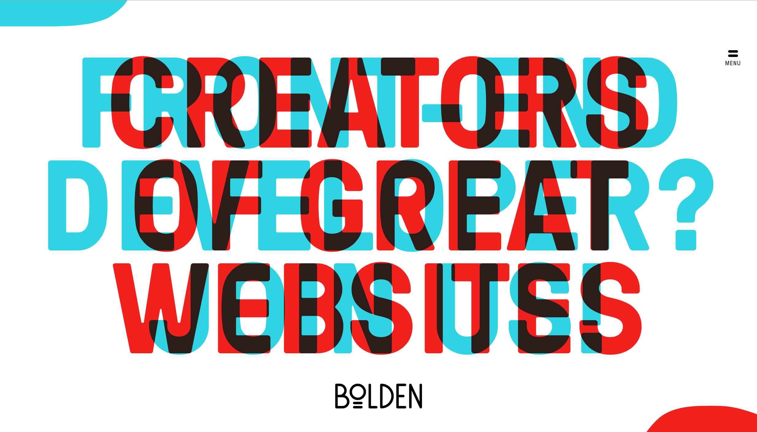
[The Shame] - bolden.nl
Readability is not a smoothly linear process. Your eyes do not follow lines of text linearly, but they focus on a specific word or a set of words at a time (called fixation). They even go through abrupt jumps when go to the next line or paragraph (called saccades). Due to this non-linear nature of reading, the alignment, color, and font style of a text all play important roles on readability. In this perspective the first example shows terrible readability as it overlapped two text, making users have no idea what the texts are. An user will take several dozens of seconds (which is huge!) to understand. Although you may try this for aesthetic reason it critically harms the learnability and the efficiency of your website, and most importantly user's ability to achieve his core tasks.
Readability is not a smoothly linear process. Your eyes do not follow lines of text linearly, but they focus on a specific word or a set of words at a time (called fixation). They even go through abrupt jumps when go to the next line or paragraph (called saccades). Due to this non-linear nature of reading, the alignment, color, and font style of a text all play important roles on readability. In this perspective the first example shows terrible readability as it overlapped two text, making users have no idea what the texts are. An user will take several dozens of seconds (which is huge!) to understand. Although you may try this for aesthetic reason it critically harms the learnability and the efficiency of your website, and most importantly user's ability to achieve his core tasks.
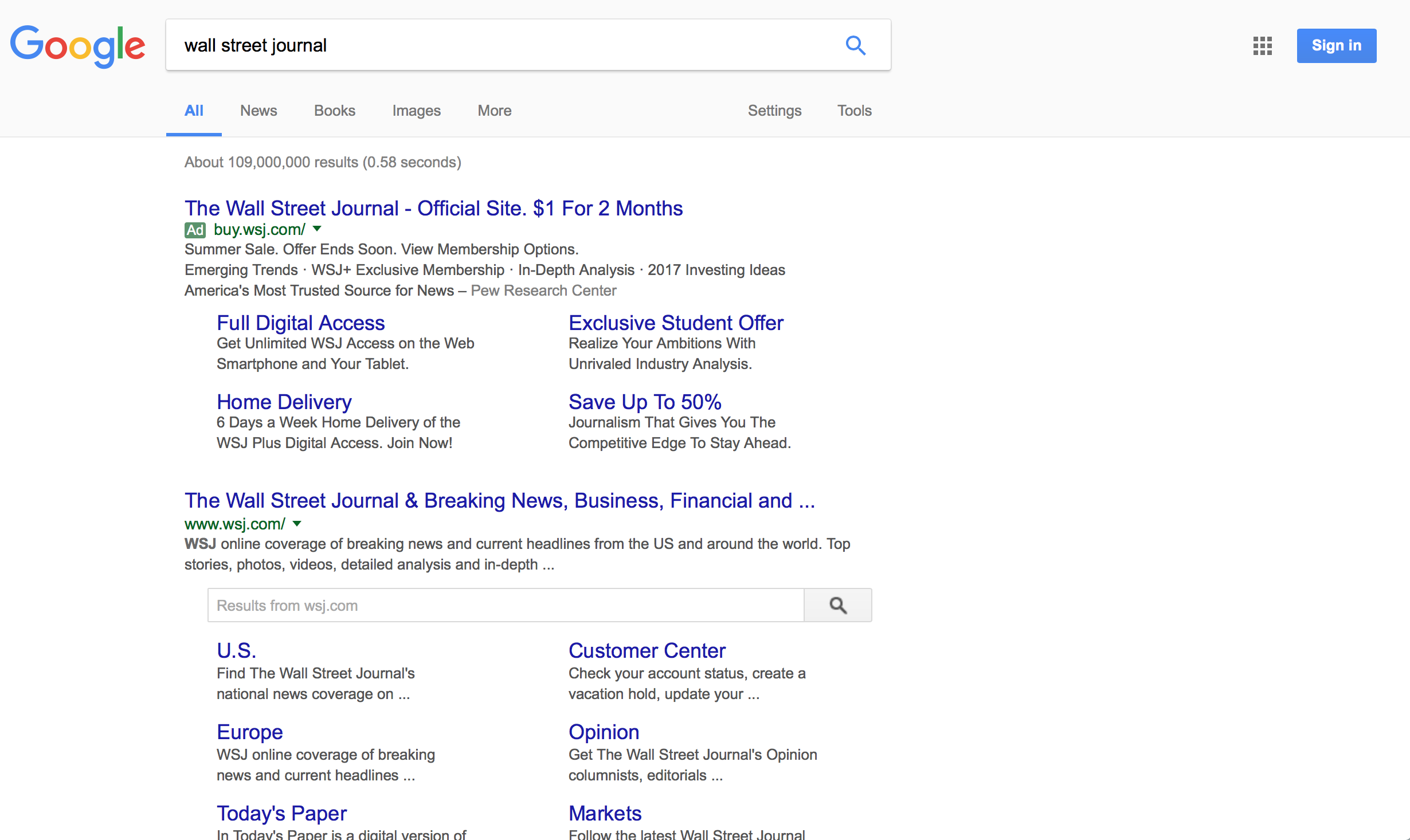
[The Fame] - Google
Google provides good readability through simplicity, alignment and visual contrast. First, they keep their page design simple so that user can focus on their primary task, which is to find right article. The page only has essential component. It even show the first part of the articles, providing more spaceing but still providing information scent. Alignment sectionalizes each articles and keeps them seperate so that user can easily see which texts are together contextually. Title, links, urls are differentiated with visual contrast (especially color and font-size). It is better to keep your design simple and organized to improve readability; then, eventually that will also improve the overall design and aesthetical quality of your website.
Google provides good readability through simplicity, alignment and visual contrast. First, they keep their page design simple so that user can focus on their primary task, which is to find right article. The page only has essential component. It even show the first part of the articles, providing more spaceing but still providing information scent. Alignment sectionalizes each articles and keeps them seperate so that user can easily see which texts are together contextually. Title, links, urls are differentiated with visual contrast (especially color and font-size). It is better to keep your design simple and organized to improve readability; then, eventually that will also improve the overall design and aesthetical quality of your website.